Thursday 10 December 2009

"Guess it's time to roll the credits."

Second update of other stuff.


I made a video with Alan in the style of an R-type/Gradius/Space Impact game (I will admit that the idea came from watching Nigel and Max's Final Fantasy/8-bit theater video) using the white board and cut outs. Here is the video without sound, which will hopefully be added tomorrow.


The colours were inverted to make it more of a spacey background. When we were making it, we had all these ideas suddenly pop up (there should be a narration with talking heads, and a squid formation etc) which were great until it turned out it meant 2 hours stood up drawing green lines for lasers, hence the cop out ending. Maybe next year if this was done on Flash instead it would be easier (once I learn how to do it), because it did come out quite well, although it needs to be darker.


Here's the newer version with sound, but it was shrunk by Premier much to my annoyance and I need to figure out how to the change that (the original had help from Bryan, much obliged). I suspect I won't be able to fix it just yet, but 'd recommend trying to play the videos together so you can get the audio for the larger view, just to get an idea of what it would be like.


The audio was a lot of fun to produce in trying to find all the bleeps, so it's a real shame that I can't fix it. Yet.

"Is that the end?"

Is this my final post for this year? I don't know. Certainly, it's the last one on this term although we've finished with the assessments and everything, so this would probably make it late. it'll be the last one using a Silent Hill theme, it's getting terrible trying to theme the titles around them. I could use normal titles actually related to the subject I suppose...

Anyway, the final assessment was a walk cycle and a walking 3D model using an androgynous rig, which really bothered me with it's creepy dead eyed fishface, but more on that another time. The walk was based on two walks I did and had to use as reference to see if I could not directly copy it position for position but to get the general feel of it. I chose the second walk, simply because I couldn't get into the stride of my usual walk with the first one so it would end up looking like stiff armed marching (although my right arm really doesn't like swinging much. Too much muscle or something).

Here's the footage-


(I didn't actually recognise myself during the assesments, which was very strange and a little but creepy to be honest. University has obviously changed me...).

2D first-

When I made this, there were originally an extra two frames but the walk came out needlessly slow in the passing position so I cut them, so it's at 18 frames. I thought it didn't work that well and looked more like a normal walk than the bouncy one, but I think that's down to the height of the figure not moving much when the figure is stood on it's tip toes to give it an extra bit of bounce.

3D-

Will be up at another date. I don't have the file currently.

I preferred making the 3D one because the video reference was at hand straight away and i could Ctrl z whenever I wanted, but when I saw it back I can see little things that niggle me, like the pop of the knees as they swing forward and the overall speed of it. I'm happiest with the pony tail bobbing on this, mainly because I think adding a little bit of secondary animation helps improve the overall look of my animations in the same way adding colour helps an image ( although with both of those things they don't cover up mistakes).

----------

The presentation went....actually, I can't even estimate how it went. I know the research we put into it and the writing took forever, but I think my choice to use basically an essay rather than cue cards might have damaged the presentation.

--------------

I forgot to upload the walk cycles from the week before last! Oh dear.

Here's the 3D walk using the Burt rig. I found it difficult to remember all the movements that are meant to go into a walk like hip rolling and the shoulders moving (although that's not going to happen on this one)so thanks for the people who came over and pointed out what was wrong with it. It's far from perfect and I need to remember in future projects to actually remove the rigging from the final render (is that the word? 0_0) but its my first go with CG walking, so I'll put it down to that.

I wasn't pleased with my final 3D animation so I made this as just a random animation test. there was a bit more, with Burt leaping to an alert position, but it came out terribly so I kept the opening part and ditched the rest.

The 2D walk wasn't great. It's a walk that I know has something wrong with it, but I didn't want to go back and change it because I'd spent so long staring at it. Photoshop may not have been the best choice to make this in, although it did cut down on paper and mess.


Any other stuff I put up is going up in a seperate update because it's not really related to this work, more personal stuff, and it's easier for me to organise them like that (I'm worried about file size uploads as well).

Friday 20 November 2009

Don't go out!- Walter

The animation festival in bradford was a great opportunity to see the kind of animations that get made world wide and the standard at proffesional level, although personally I preferred the student animations which seemed a lot fresher in terms of ideas. A lot of the animations felt a little too pretentious for me personally, even if they did have a good visual style, which goes to show that a strong narrative or idea is as important as the look of an animation itself.
Of the ones I saw though,
Mary and Max, Ink, Coraline, Simon's Cat, A Traditional Christmas at Small Birds Singing, Tom and the Slice of Bread with Strawberry Jam and Honey ( for a slightly different reason) and Melody Gone
were the ones that stood out for me, and even then I had to look some of those names up.
And, obviously,
Up.

Being an animation festival there isn't much you can really take photographs of currently showing, but here are a few photographs from the museum-


While in Bradford, I did some sketches for the life drawing brief but as that's been handed in there's nothing to show for it. Alternatively, I did get to practice some character designs, although they are incomplete.


This is a rough of Kushi, a vixen for my manga-styled anthropomorphic comic Fox fire. I've had some problems designing her trying to get the look of her right and I think this version comes pretty close, although her tail needs something to mirror her hair bands. Getting the position of the legs is something that always troubles me on this comic seeing as digitigrade legs are awkward to get the correct weight distribution on. I think this drawing woud be good for a colour test (themed around red).


This is costume reference from a joint web comic I help on, although considering my update spped I'm probably going to get kicked off of it fairly soon. The web comic is based in and around north mythology, and this character here is one of the ones I originally designed ( we both have our own "set" of characters we write part of the scripts for and draw the comics for) named Ka Agnor. He's a demon/dragon half breed, who spends most of his time in his human form and is tasked with tracking down the escaped Fenir. I like writing for him because he really couldn't care less what people thinks of him considering he could punch them through a wall. That and he's technically insane. There are other drawings of him in other costumes but I hadn't finished them. If I get these two inked and coloured I'll pop them up here.

Monday 9 November 2009

"This Blog...theres...something wrong with it..."

I would have posted this earlier, but I thought I'd lost my flash drive when I actually had it on me. Fun times.


The main thing I'm happy with producing this week seeing as we weren't set any topics) is the cutout animation. I started making this thing sometime before the day, as I only really wanted to practice the movement for a better one (which, providing I can get it made, will also be posted).


I was really surprised by how much I actually liked the look of this animation, and I think it's down to the fact cut-out animations seem to make up a large percentage of the old-fashioned animations I used to watch when I was a kid (Mr Ben, Monty Python and er, South Park, which I probably shouldn't have watched). I think cutout animations seem to come across as being particularly antiquated which I suppose could be a bad thing but I personally like how close they can get to zoetropes and silhouettes in terms of aesthetic appearance without losing something in the transistion to a digital medium.


Here's the longer one I only just completed (although I was kicked out of the studio,so it isn't completely done). There were going to be more things in it, but it really needs to wait until I get back from bradford before I can start putting the pauses and the like in it so it's a bit jumpy currently. I did start when the bird tries to jump up.


The look of this was based heavily on Okami, which is one of my favourite games, and is specifically where I copied the cloud design from. I certainly want to try animating in this style again, although if I could put sound to it I'd be much happier.


I'll reedit this post at another date and put all the pretty reference images in and everything, but not right now as it's very very late and my brain might possibly asplode.


I have also been producing little pixel people, short two frame animated GIFs that don't take much in the way of skill, so I've been doing as many as possible. here's an exapmple of one, although I suspect it won't move. If it doesn't then I need to upload the lot of them on to DA.


It worked! Here's another one-


Finally, for a proper bit of art, here's a picture I was sketching out in Photoshop ( I practice this character every so often to try and improve drawing human faces. It's still in a manga style I'm afraid).


Monday 2 November 2009

"In my restless dreams I see that Blog..."

"You told me you'd update it again one day, but you never did."

I'm going to have to stop with the quotes soon, it's getting hard to think of new ones. Time for a new theme me thinks.

The 2d task this week was regarding anticipation and overshot, trying to create the most organic and natural ways of capturing motion in a movement. For this task again we used the illustrious Cubey and his friend Slightly-bigger-cubey. The idea was that small Cubey gets ready to jump (showing the anticipation of building up the energy to leap), makes the jump and lands by the larger Cube (leaning forwards as it absorbs the impact, being the overshot before it straightens itself out), the larger cube looks down and the smaller cube reacts in some way.

One thing I found with this task is that the number of frames were significantly higher this time round than before. Mine totalled at about 38, which is miniscual compared to the more adventurous animators.


You know I very nearly named this "companion cube"?

Making this one, I was halfway through the jump when I realised the cube was travelling far too fast for it to slow down enough to stop in front of the other cube, so I had it crash into the bigger one. The FAIL was added afterwards, although I'm terrible at typography so I'd be better off using a PC.

All my 2D animations seem to be extremely malleable. Whether this is good or not I dont know, it might be a problem trying to animate anything that isn't a cartoon character.

There are too many frames in the jump, making it oo slow, and Andy told me that thenother cube needs to stop moving so much so people can focus on one character. i suppose I like the animations to look busy but he is right, it's distracting. I will learn from this AND BECOME MORE POWERFUL THAN YOU CAN POSSIBLY IMAGINE.

Onto 3D, Cubey gets another friend to play with in the form of a ball. I'm getting slightly more accustomed to the program, although I still don't enjoy the tasks that much. I'm going to try more experimental and interesting anrratives in my 3D stuff because I've been taking the easy route with most of these to get them completed on time, but theres no reason I shouldn't actually learn how to use the program properly.

Nothing espeically interesting here, although I made Cubey slide rather than step so I could get a little overshot in there. Hopefully that actually shows.

Other than that, there isn't much else I've done. Rejection Girl is slowly being made, so it may be up eventually. Before christmas at least. I do have several ideas for the cut out animation fof this week though, so I'll be linking to several different sources for that.

Friday 23 October 2009

"And that stupid Blog! He had it coming too!"

Boy I'm running out of Silent Hill quotes fast.


The continuing escapades of El Cubo continue. This time I've animated him doing a poorly executed backwards flip (or forwards, I lost track of where he's meant to be facing) as I couldn't for the life of me find out how to speed him up, so if anyone asks this is animated in a zero G atmosphere.


Another of the tasks this week (although its more of a "do or don't, it's your degree tasks) was pixcellation (I think it has a different spelling compared to doing something using pixels) , animating people frame by frame as if they were a puppet, like the works on the Pez website or Jan Svankmeyer. One of the confusing things I find about pixcellation is when objects get involved. At what point does pixcellation become stop frame animation (although technically all animation is stop frame animation) , is there a limit to the amount of time an object can be used on the screen before it's considered a different category or is it solely the physical presence of a person or a part of their body being animated that makes it what it is?


Not that any of that actually matters, but I digress. We made some pixcellation videos as a group and also experimented with our own ideas sing the Rostrum camera (which I found much easier to use purely because the digital camera takes so very long to take a picture).

Here is the rather literal paper cut (because I like puns).


You might see the above on Chloe, Al's and Thomas' too, or at least you should because they're welcome to it!


Here's the group effort, made out of a collection of tests, so we now have the ground work done out of the way ready for the all the important massive narrative pieces. Probably. Or at least some smaller work now we know the limitations of the medium.


OK, if this video still doesn't come up I'm putting it down to site retardness, not the file, because as far as I can tell it's still good.


That's it for this week, there was going to be a Rejection Girl quickie but it's so quick I haven't caught up with doing it yet.

Friday 16 October 2009

Making a Blog ain't such a big deal...


I'm posting this a day earlier than I usually would, purely because I'm away tomorrow, but anyhoo...


The projects this week revolved around BALLS (ahem) and animating them using stretch and squash principles and giving them the illusion of weight. I'd tried to use a little bit of stretch and squash on the egg transformation to give the egg circle a bit of bounce, so I was quite happy animating the 2D part of it.


The other 2D project was getting Cubey the Cube to bounce up and down. I used the same amount of frames for both animations (6) before reversing it to get the bounce effect, but I think the ball was more effective. There's something wrong with the way cubey hits the floor, I think it needs more frames.


The other two projects were both using the program Maya, which I've found myself to be rather unproficient with. What's worse is seeing recent CGI movies such as Up and recalling the two animations I eventually managed to churn out, but here they are anyway.


I'm not especially pleased with either of these but his is the very first time I've used 3D software, so theoretically I can only improve. I hope.


On the Life drawing front, I've been trying to get a little more movement into the figures I've been drawing as I only ever seem to catch people lying down or sitting. here's a few examples pf the more recent ones I've done.


The last one is my favourite purely because it reminds me of the double-sword wielding android "Kuma" in the anime 'Afro Samurai' which may get further mention on this page purely because stylistically it's very bleak and unique in appearance.


You can see him here! ------------------------------>


One of the other life drawing examples I mentioned last time were the skulls, and the one based on a certain skull that seemed to have a lot of personality.


The main reason I like practicing skull drawings is because it reminds of a creature I designed for one of my Web comics, called a Sheepish.


http://www.drunkduck.com/Andantino/index.php?p=346835


That's a nice inked example, and here's a coloured one-http://www.drunkduck.com/Randomology/index.php?p=290342


Basically (when I eventually write it) the premise of the story is that Andantino, the title character, is mourning the death of his wife and lamenting his inability to do anything during her illness and missing her final words to him. A strange celestial creature appears and tells him of a gate souls pass through on the way to the after life. As the souls pass through the gate, their final thoughts are seared on to the walls, and encourages Andantino to travel there to ease his guilt.


The rest of the story is still very much in progress, but I'm mentioning this because I always had the intention of making Andantino an animation before I considered it becoming a web comic. The story is based on a piece of classical music by Debussy, which had such a long name I lazily shortened it to "Andantino". If I can find a link to the piece I will post it at a later date, but while listening the song reminded me of a poor, sad man, crying over his wife...


If I did turn Andantino into an animation, then I do already have a soundtrack for it! Working to a piece of music is something I'm quite interested in because of the choice of either applying the song post production or making something that responds to the tempo and rhythm visually, which Andantino would. Visually the style would be very much like the comic (black and white), so when I watched Fears of The Dark, a French animated film, one of the segments had a particularly eerie charcoal like style-http://www.youtube.com/watch?v=ijZK_0wZ-0s&feature=related


The story ended pretty abruptly and poorly in my opinion, but the visual style was intriguing.


I realise that this is an enormous post considering it hasn't felt like I've done much this week, but finally I've made some designs for Rejection Girl and I will hopefully have a very short animation of her up in a few weeks. Here she is, looking mopey (colours are not final).


And that's it hopefully, the end of whittering for this week.

Friday 9 October 2009

There was a BLOG here, but it's gone now.

Okay, the first week is up and this is what I've been up to.

Life drawing sounds like its going to be pretty interesting this term. i normally suffer terribly doing lifedrawing, mainly because although Manga tutorials are an excellent starting point for proportions because (surprisingly)the body proportions are the same, getting out of the habit of drawing men as muscular and people with overly large eyes compared to their face doesn't happen easily.


The project is drawing figures, but replacing the head with that of an animal. We're being instructed to look at the work of J.J Grandville (apparantly he was also called Gerard, but I think J.J sounds more slick) a french satirical artist who created anthropomorphic representations of Parisian society as a strange mirror to show the more bestial aspects of a person. Here's a pic-


The point of the exercise is so we don't get hung up on drawing faces, which suits me fine because they're my worst part. It also opens up some research into anthropomorphic art,which I have tried (although with more animal bodies) but can certainly help me improve.


I do have some lief drawing of various animal skulls to post up, but that will have to wait until I use the scanner because my camera decided to die on me, bless its cotton socks. I rather like drawing skulls for some morbid reason, and found that because of the blankness of expression of the eye sockets and exposed teeth that drawing the skulls from different angles could give the skulls more emotion. I'll post more on this next blog when I hopefully have the images, but there was a particularly coy looking skeleton that was from a "Chevrotain", which is a mouse deer-

Cute, isn't it?

Animation wise, the group have had to animate a circle in 12 frames that shows it morphing into something, before morphing back to make a big ol' collection of shape-shifting circles. I went for something obvious from a circle shape, an egg, so I made it a little more complex by having it bounce upwards before it hatches (briefly).


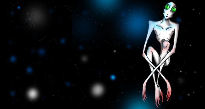
I liked this one, but I decided I wanted something alittle more complex. There isn't much point in creating animations if I keep going for an easy option, so I had the idea of turning the circle into a doorknob and the real focus of the piece being whatever it was behind the door...here's the rough version before it was coloured.

I got the colouring idea from seeing the sketch work of Darrien Gibson (http://darriengibson.blogspot.com/), who uses big swathes of colours you wouldn't expect to go together to give a strange acrylic-like effect just using markers. This was made using mainly felt tips.

I like this one, but I decided it didn't really keep to the project brief of a circle morphing, being more a circle turning on it's side, so I handed in the egg instead. Still, this one continues my love-affair with japanese mythology (that's an onryo if you didn't know) and gave me some experimentation with colour.

Whil working on the ghost above, I had an idea I'm tentatively calling "Rejection Girl", a collection of simple line-art animations featuring some poor girl being turned down by every man going. I think if I can get several done, I'd put them together into one larger one. So far, the possible ideas I've thought of include her being turned down by the sun and a manga character for being a different art style. I'd like to do these with other people if I get the chance, so I'd better get stalking-er, looking for creative people.

Monday 5 October 2009

In the beginning...

...people had nothing- ah wait, wrong section.

Well, as the information on the main profile page told you my name is Sian and I'm studying Animation at Falmouth as part of the three year course. This Blog is to keep track of any projects, any ideas, sketches, videos, inspirations- whatever is related to the course, it's going to be posted here.
Being literally the first week on the course mind, there isn't much I can exactly post, so I thought I'd put down a few of the animation related things I've done in the past so people can get an idea of where I'm coming from.
I did a foundation course over the past year, and ended up assigned to the Media based group, which had a real mix of people from different areas (I think one guy was doing sculpture there) but I decided to focus on animation for the final half of the course.

I started doing looped GIF animations to get a feel for Photoshop and computer colouring software, so I made two(which were originally going to be part of a quartet) based on Japanese Mythology, namely a Bakeneko (cat with two tails or split tail) and a kitsune (multi-tailed fox), drawn in an anthropomorphic style-

(The kitsune)


(The bakeneko)

As GIF's these should move, but if they don't I'll link to my deviantart gallery if you're interested enough to look them up. I'm still pretty new to this blog thing.


Making these basic GIF's was pretty fun but time consuming, so I decided to go for a stop-start animation in the style of the old Morphs. I built the set so that the backgrounds could be reversed for the next sequence so I could save time filming (the bedroom and kitchen are the same set). It was filmed in sequence in about a week, about an Alien abduction of all things using some very cheap materials such as a thick coat to film the night sequences. The two characters were called (imaginatively) Death and Ghost, and were a chalk and cheese couple made for an almost sitcom like set up.
You can watch their first appearance here, as part of a Black and White project (the snow walking sequence is still the thing I'm most proud of producing)


Their longer outing is here, called The Visitors (there were originally going to be more aliens than just the one I made). I'm happy with the animation but the sound quality is dreadful after being recorded at 4 o clock on a pc gradually dieing from the outside in, and the timing needs work. I can't get it to load via the file, so you can view it here-http://www.youtube.com/watch?v=zmYr9FgIGy4

Other than those I've mainly made a few more GIF's trying out random thoughts I've had in my head, but nothing interesting enough to mention here.

So that's the work in the field of animation I've done so far. I may make another post at the end of the week after I've had time to get my thoughts in order ready for the projects to begin, along with any inspirations or artists I admire.

Other links to my work are http://pionpi.deviantart.com/ , my DA account with more of the arty things and concepts etc, and http://user.drunkduck.com/confusedsoul , where I store my webcomics ( most of which are on hold).