
------------------------------------------------
I will make a pdf of this but here's one of the initial pages of the storyboard for the cinematography project.
 I think despite the fact the characters are drawn as indistinct blob people I was thinking of a storyboard for an animation rather than a film and drew every action of the characters like the actors wouldn't be able to work it out themselves, meaning it's far too long for the amount of action displayed. I gathered from the storyboard we were shown that more detailed images solely for illustrating the type of shot are more appropriate. My current roles for the project are producer and storyboard artist.
--------------------------------------------------------------
When I was researching Apollo, apart from him being a sun god/medicine god/plague god/oracle/general arse as is befitting the greek pantheon, there was a study of two schools of thought in psychology called Apollonian and Dionysian, being sun and earth deities respectively (or cthonic for earth, which sounds so fancy I'm going to try to fit it into my usual vocab). The idea goes that Apollo represents logic and structure while Dionysis represents artistic expression and wildness and with the two together the best tragedies come about- a man tries to create order in a world of a uncontrollable nature and ultimately fails.
The idea I had is the reverse of this- the satyr, as a dionysian creature, is only really concerned with drink, girls and having as much fun as possible but is forced to work by Apollo in a sort of parody of fun, that isn't enjoyable at all. Sort of a reverse of the usual tragedy, in which individualism and freedom of expression is crushed by the pursuit of logic and conformity. Gosh I'm deep.
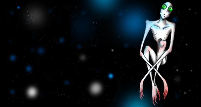
There will be designs of Apollo posted at some point, he's a pain trying to come up with something.
Here's a few of the backgrounds I've been trying out for the Pre-production, messing around using Corel Painter's artist oils effect. The learning curve for this program seems to be brutal, so I'm not going to attempt drawing characters in it. At all.
 The purple light was meant to look unnatural, but I actually find it quite pretty. One of the ideas I had was that the desert the theatre is set in was actually quite a beautiful place, but it's the presence of the theatre and Apollo that is starting to make it more rigid and structured, losing it's wildness. This is probably a night scene, although with surrealism it's hard to tell.
I'm unsure how to texture in Corel so good, reliable photoshop is there to help out. I wanted to use lots of tectures in this project for the audience and other characters to give them a weirder look, although I need to find out how to use masking properly.

Sort of a WIP as I want to put the Theatre somewhere in the background sucking the colour out of the scene. I was looking at Salt flats for other floor textures and some looked like hexagons, which made me think of a lizard or serpent. This isnt the back of a creature, just a scaly desert.
As tempting as it is to start chucking in some Aztec imagery that's too close to Yume Nikki than I imagine is allowed.
I've done these, but I'm so stuck on this project. Drawing realistically is really, really hard and trying to stop one of the four topics from drifting out of focus from the rest is problematic, particularly the middle ages. All I've got that references it is The Black Death, srsly. I just spent an hour and a bit putting this together rather than attempt anything else. Right now I feel incredibly stressed but there doesn't seem to be a way around it.


