Wednesday, 26 January 2011

ɯsıןɐǝɹɹns

I've been practicing Satyrs for a while now so it's about time I moved on to something else to give myself some more inspiration regarding the plot. What confuses me is how bad I am with abstract concepts, demanding rigid structure and narrative in everything I do while surrealism isn't meant to be like that at all. I have some serious mind mapping or something similar to get around to. Even if the animation is unstructured I can rigidly order the research of it!

Following the lecture, I've started compiling the surrealist artists whose work I want to use as an inspiration for the characters and designs. I'd begun looking at Max Ernst as his Fireplace Angel is one of my favourite pieces of art but I didn't know about the collage part of his work which has given me an idea regarding some characters in the project.


I love the mans body language in the picture below. It's so 'mildly interested' at most, like he's saying "Reeeeeeally?"
I'm veering more towards the idea of the characters varying in style from one to the other; or perhaps sections of the cast have different styles i.e the main cast are done in a painter-ly style while background characters are cut out or collage etc.


I first saw Leonora Carrington's style on a video for Erik Saties Gymnopedies and the creepiness of the characters in the images always stuck with me. Most of the images seem very blurred and indistinct without a sharp outline with simultaneously a very distinct use of colour, reminding me of how dreams are both vivid and difficult to remember.


Because he is one of the most famous Surrealists in the movement, I looked at Dali. What I did notice about his works is the emphasis on realistic painting, such as for the tigers and fish below. Seemingly the situation and placement of the more realistic imagery is what creates the surreal imagery.

An idea I've had is that the main characters of the project are animated in a style where their outlines are similar to Carrington's art, soft and blurred but closer to a more realistic style proportion wise. Other characters would be far more strange, made of collage or strange textures with un-natural movements

Thursday, 20 January 2011

Continued Research

Continuing on from my initial research, I decided I would continue looking at Satyrs and Satyr myths. Firstly, I found out how to actually pronounce the word (it's SAH-TER, providing that's not American English although I don't know whether that would affect it or not.) Secondly, I looked more into the general mythology behind the creatures.


The paragraph that I posted previously was actually very accurate as far as consistancy goes as most other sources I've looked at have the same intentions and descriptions (excluding the phallus, that gets omitted in most), so Satyrs always seem to be-

- Followers of the god Dionysus/ Bacchus

- Revellers, consumed with chasing Nymphs, getting drunk and playing music, particularly pipes.

- Forest dwelling creatures

- Always with small horns in their forheads and tailed, although the lower-goat-half thing seems to be more of a later idea and earlier Satyrs looked like regular (albeit very hairy) men from the waist down.

Marsyas, Silenus and Pan are famous Satyrs in myths, although Pan is actually more of a god who looks like a Satyr, rather than being their chief deity.

Silenus varies between being a Satyr and being a Sileni, which is almost a pallette swap of a Satyr as the only real difference is it's a horse lower half with (presumably) no horns. Silenus could prophisise and despite being from a race of literal party animals was rather on the cyncial side, as he answered the question-

"What is the answer to happiness?"

"Not to be born at all is best, but having passed through the gates of birth, the next best is to die young."

He sounds fun at parties.

Marsyas was a Satyr that became masterful at playing the aulos, a type of reed instrument and challenged the god Apollo to a contest. He either lost because Apollo had it judged by the Muses or because he tricked Marsyas into agreeing to play his instrument upside down, which was impossible, but in whichever version Marsyas is always punished by Apollo by being flayed alive. I particularly like this myth as it ties into one of the other cards I have, Live at the Apollo, although only on a name basis. Still, that itself might be enough.


Pan was involved in a few other myths as a god of , but the information that caught my eyes was that Pan particularly liked causing panic and fright and his domain was in forests and caves, taking advantage of the ambience to frighten people.


As of yet, I'm having a little trouble creating a plot that I know will keep my interest for the whole of the project. I'm concerned not so much with the style or setting or characters, but the Live at The Apollo part of it, as that show is just people doing stand up and literally just that. I'm trying to construct something based around the idea of a stage, and being forced to perform for someone elses amusement. Satyr's or men dressed as them would make humourous jokes at the end of some tragedies, hence the word satire, and as drunken sex obsessed hedonists they are very much like most recent comedy protagonists, so they do work well as comedic characters. it's trying to find a new angle on the stand up part of the show that's the trouble.


I have been practicing drawing the characters though. This isn't a specific character, more like a way to practice getting the right sort of look first.

I started off getting some reference of Goats, particularly goats heads to see the way the horns grow. Because of the hairiness of Satyrs, I needed reference of beards and the way they grow so it wouldn't sit cartoonishly on their face. I sketched a few people around the studio and a few from online sources although I think it's pretty obvious which drawings got more attention.


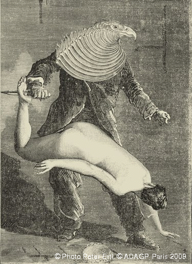
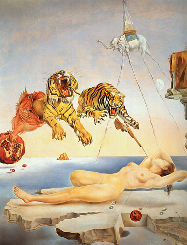
These Satyr's are more practice so I can fit the style into the character design. I have Surrealism, and I've noticed in the work of several Surrealists like Dali that their work is often drawn or painted very realistically, with non-realistic subject matter.

I'm thinking that the style of the characters in this project will be a different one to the setting of the world they're in- as it's a medieval/ middle ages setting I think I could get away with more outlandish designs for the backgrounds than that of the characters- I'll try to explain this in another post on Surrealism as this one is already quite long. Nothing is set in stone yet so I'll have to see how this idea pans out.


Designing the Satyr's, I decided I don't like the more human-with-horns look because it reminds me too much of Mr Tumnus from The Lion, the Witch and the Warderobe and he's far too nice a character compared to normal Satyrs. I thought if I went for a mixture of goat and human features like a wide, flattened nose,eyes with horizontal pupils and goat ears then the result would be something slightly uncanny, recognisable as having human traits but slightly off rather than being 100% goat or man. Trying to get the right balance between the mixture is quite hard, as if it's too close to a goat it no longer resembles a Satyr but if it's closer to a human my drawing style makes it more cartoony than anything. Not only that, but drawing things that are meant to be slightly odd looking makes it harder for me to decide if I like the design, if that makes any sense.


Of the above, I'd say that the far right and lower right are too goatish, while the top and lower left are further along the human scale and the one with the llama like appearance ceeps me out in particular. The 3 centred ones are closer to how I want them to look. I like both the goat-like ones to the right and below of the centre and also the more human-expression the centre one has, so I'm debating whether to vary the goat to human ration based on these small perimetres.

Thursday, 13 January 2011

Picture this...

With the preproduction and post production project, I've chosen to do Pre production as I think most of my strengths on the course are in this area of animation.

With the randomised cards, I recieved-

Character-
Satyr

Show-
Live at the Apollo

Style-
Surrealism (Originally Picasso but COME ON! I can't work with that!)

Setting-
Middle Ages

So I've certainly got a lot of things I can research historically. I'm leaving Satyrs for the moment as although I've browsed them online, I'm hoping to get some Mythology books out for something more indepth. However, here is some copy and paste research from a website on them-
"The satyr comes from Greek mythology; they were companions of the Greek god of wine and entertainment, Dionysus. There was no actual female of the species until “satyress” was invented by poets, seeking to make the ever lustful satyr a female companion."

Better it goes after it's own species, apparantly. I haven't found when the term satyress was created yet but it sounds like something much later, so that might fit into the "middle ages" theme for the greek mythological creatures.
"Satyr is the root of the word for satire, which generally means comedy."

Which, if true, woud work very well with the Live at the Apollo theme or at least is worth horrible pun. That and I've been mispronouncing it constantly.

"The satyr was generally depicted as a man with sometimes cloven feet, small or full horns of a goat, large, point ears and a constant erection."

I might not include that last part into the designs. Might.

" In mythology, they are usually associated with comedy, sex drive, mischief, and fertility; they roamed the woods and mountains. Usually, satyrs were quite busy preying on the various forest nymph; minor deities and children of a union between mortal men and women and gods. Satyrs were said to be obsessed with them and are often depicted in different mediums of art as copulating with them, or at least trying to."

Satyrs seem to be work shy, sex obsessed drunks to smmarise them at their most basic, which is the same stereotype as a lot of comedy protagonists. I'm also looking at the story of a Satyr who challenged Apollo to a musical contest and lost sorely which would be a really wonderful thing to use as reference for a story.

What I've been looking at in slightly more depth is the surrealism, although beyond basic artist research I'm not very far with that either. I'll post more on it when the research is done rather than picture links as the upload seems to be broken on blogger right now.

Here, however, are some examples of surrealism in animation I found.


This is a frankly insane series of short animation called Popee the Performer. the stories follow Popee, the guy in the stripey rabbit suit, and his 'friends' Pepee the circus leader(?) and Kedomono the wolf (my personal favourite). The three live in a circus in the middle of the desert and generally don't get on at all. Examples of story lines include anticipating the other persons movement so much they stop moving completely, becoming ghosts to stop someone killing them and creating an imaginary friend to steal somebody elses imaginary friend.

They're extremely random, frequently very funny if you like bizarre humour but 'd say he example I posted above epitomises the kind of surreal atmosphere of the show and the strange setting.


You know, I was checking through my posts to see if I'd already linked to this video, but it doesn't seem like I have. I am surprised!


This is an advertisement for Loius Vitton for a new range by Takashi Murakami, a japanese artist who both parodies and exploits Japans obsession with cute and childish things. This particular advert was directed by the director behind the Digimon film, in case you recognised the style of the little girl.

Anyway the point of posting this is because of the strange way the girl ends up inside another dimension and the general oddness of the environment.

Wednesday, 1 December 2010

11 second final animation

11 Second Club Project Report

At the beginning of the second year, we had two projects set for the group to work on from the start until near the end of term. One of these was projects was to animate characters to a sound clip provided by the 11 second club website, taken from a film or television program. We would then have a month to complete an animation, providing we intended to use the current month’s sound clip.
I chose to animate the sound clip for November, taken from the film “Trains, Planes and Automobiles”. The dialogue in the clip was-

Speaker 1: You stole it!
Speaker2 : I thought (Speaker 1: I-) you put it there!
Speaker 1: ...Why would I put it there?!
Speaker 1: Kindness?
Speaker 2: ...Kindness?! You stole it! He stole it!

The dialogue between the two was a heated argument, with most of the anger directed by speaker 1 to speaker 2. They’re also arguing over something that was apparently taken by speaker 2, so the scenario is a confrontation. For the animation to make sense the stolen object would have to be alluded to visually as the clip is probably referring to something set up previously.

I ran through a few scenarios involving something being stolen, such as two archaeologists arguing over the theft of an artefact or two roosters arguing over an egg. The second scenario made more sense to me as the problem I had with creating scenarios was the line “why would I put it there?” meaning it had to be something that the first character didn’t want to either give away or keep themselves meaning the archaeology didn’t work. I didn’t like the second scenario because i felt using roosters (or lizards and foxes as were the other designs) was sort of bland.
Talking to a friend, he mentioned that part of the background sounds like the crackling of a flame or like a vehicle moving and I thought of the Greek myth where Prometheus took fire from the Gods to give to humanity, and decided that that would be a great scenario to use.

I started looking at old classical statues of Zeus and Prometheus to get a rough idea of how they’d look. My main problem is designing Zeus is I didn’t want to end up with a version like in Disney’s Hercules, but because of the fact that almost all the statues of Zeus share a similar look it was hard to know how to develop that without losing what makes the character recognisable. I ended up varying the guy’s hair and beard but kept the general muscular appearance to suit the angry sound to speaker 1’s voice, making Zeus appear more as a bully (not that he isn’t in myth). Prometheus was easier because he’s less well known, so I went with a skinny, shorter design to Zeus to suit the whinier voice of Speaker 2.

One thing I noticed with the sound clips while creating the dope sheets is that presumably the sound clip is taken from a comedy because of the large pauses for speaker 1’s reactions. I planned for the scene changes to occur during these points, and decided that I’d keep the character animation still at that point to act like a beat panel.

Because of the flame sound in the background I needed to set the scene before the voice clip started up, so I had humans bowing around a large bonfire. Although I’m quite pleased with the finished effect of the flame without having to rotoscope it, making it take up about 2 extra seconds crippled the amount of time I had left to complete the character animation so it feels like unnecessary filler taking up the time I should have spent on the character animation.

With the animation, one of my biggest bug bears was trying to get things to move in arcs to look more natural. Zeus raising his arm to put his hand over his face originally had a much more exaggerated movement that went completely out of frame for a bit but because of the amount of frames allowed for that movement I had to scale it back to keep it to the right timing.

One of the things I’ve been criticised of before is animating too much at the same time, so I made a point of keeping both characters moving only when they’re speaking, so the focus is on them. I did have P moving in the last shot trying to get up from the floor, but I realised that if Z was moving in the centre of the shot and the eagle was moving off to the side, having movement in the opposite corner would make it too busy.

I think the most obvious and damning thing about the final animation is that it simply isn’t finished. I would put illness down to this in part but more likely it is terrible, terrible time management on my part. I started this project far too late in to the term with characters that were more complicated to animate than something simpler.
The flame animation took far too much time and should have really been completed more towards the end of the project. Focussing on secondary animation with the characters before all of the rough movements were mapped out means that only parts of it ended up being inked as I didn’t have the time to plan and test the movements beforehand. I would try to complete the secondary animation on some of the shots before the primary animation of others had been done.
For me, the movement of the characters seems very rapid and like there should be more holds but as I can’t change the length of the sound file I think the transition between shots meant that the movements looked rapid. Keeping the characters to the correct proportions and trying to indicate weight without a full body was very difficult for me.


--------------------------------------------------------------------------------

So that's the projects done. I'm certainly not happy about my 11 second but the experimental made those two weeks of dope sheeting all worth it.

Tuesday, 30 November 2010

Experimental Animation


Because Moodle is being (in the politest terms possible) massively crap this is the only version of the finished experimental project that I can upload.

Saturday, 27 November 2010

Video tests

Trying desperately to get the animations to show up, I've made 4 WIP's of the current progress of the 11 second club project.

The animatic, with the most basic movments planned. The final shot of the storyboard that I hadn't decided on ended up being used as I liked the idea of the third party being next to the confrontation rather than in the distance as I'd previously planned.


The first attempt, I was originally going to rotoscope the flames which would have probably been ten times easier, but instead I drew them out using a few beginning frames as reference. Turns out flames are very hard to do.


The second vid. Slightly more detailed in the actions.

The third WIP has more detail in the movement of the characters. I removed the red lines for this version so the blue lines would be more obvious and changed the gesture of P's from both hands to only the one because I thought it looked more natural.


Fourth Wip and not far from when I start inking. The lip sync was added before the eye movements as I wanted the mouthes to be as exaggerated as possible without relying on the eyebrows for the expression too much. It's hard to lip sync mouth movements like "ay" when that expression normally appears as a happy mouth shape, so I had to twist some of them to look angrier.

Saturday, 20 November 2010

The Rough Work


Designs for the Eagle have been done. It isn't meant to do much body wise apart from react to Z's rant at the end, so all the movement is in the face and head.
The Warhol-print was just for some colourful fun.
Most of the Eagle's reactions are drawn here for reference in the animation. I will probably have to do one for Z and P rather than trying to guess what the face will look like.
Design wise, it's just a big eagle. Not much more to it than that.

--------------------------------------------
Okay, I have tried repeatedly (last time was about the eighth) but I cannot get videos to upload on to my profile with the current internet, either with blogger or youtube. If I can find a connection good enough to get some up I have some WIP's to upload, but until then it's a no go.