
h0le was, surprisingly to me, picked as one of the 16 animations to go forward to the next stage of evaluation, based on storyboards, pre-production and an animatic with completed scratch track. I say surprising, I was so nervous pitching the idea I'd forgotten most of the experience and peoples reactions before the day was out.
So currently I'm re-doing the rough script I wrote up before I start any storyboard roughs and I'm trying to decide on what the blue words should say and I've encountered a problem.
As this is a heavy-handed metaphor, what helps a person out of their depression?
The basis of the blue words is that they symbolise that the white creature (should I name him and the black thing? It's getting tiring writing "white creature/black blob" all the time)is not alone at the bottom of the hole, despite how he may feel, so the words need to be encouraging.
But is this enough? Certainly, for any amount of time a person spends depressed words become relatively meaningless. I suppose in the context of an animation, they're more of a kick-start to the white creatures determination to already leave the situation he's in.
So the words are more of an assistance, shown in the way they become hand holds in the climb up. Unfortunately deciding what types of words should be used is more of a problem because its difficult to come up with phrases that feel genuine, rather than theatrical. Having the inside of the hole looking like a collection of fortune cookie sayings would be terrible.
I've decided against making a blog for h0le, yet. It's early days and I'd rather the project made it through to the next stage before I start making official looking things.
Heres a quick animation I made. I'm badly out of practice and still trying to decide on which software to settle on, this was TVP.
Thursday, 10 November 2011
Tuesday, 1 November 2011
h0le: Pitch


Tuesday, 25 October 2011
h0le: additional research
Trying to find some kind of pose reference was strangely difficult today, couldn't find the right things anywhere. However, Derek got me looking into an artist called Saul Steinberg to get a different perspective on using symbols and marks instead of actual words for the abuse (and nicer things) being hurled into the hole. Here's some of the works that I thought were relevant to the theme.


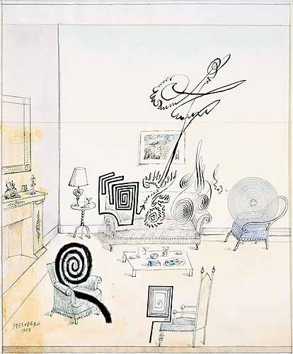
I found more images here but I'm prevented from sharing them, so you'll have to check them out here yourselves. Sorry about that.
-----------------------------------
Another artist I found completely by accident today is Beksinski, a polish artist whose work reminds me of a mixture of Francis Bacon, Giger and a dollop of surrealism.
(click for full size)
I saw this piece-

-and the skinny, stretched limbs really struck me, so I looked for similar pieces he'd made.


.jpg) I don't intend to make my animation in this style because that would be bonkers, but I'm tempted to do a piece of concept art on a similar style to make it look as grim as possible.
I don't intend to make my animation in this style because that would be bonkers, but I'm tempted to do a piece of concept art on a similar style to make it look as grim as possible.
I found more images here but I'm prevented from sharing them, so you'll have to check them out here yourselves. Sorry about that.
-----------------------------------
Another artist I found completely by accident today is Beksinski, a polish artist whose work reminds me of a mixture of Francis Bacon, Giger and a dollop of surrealism.
(click for full size)
I saw this piece-
-and the skinny, stretched limbs really struck me, so I looked for similar pieces he'd made.
I don't intend to make my animation in this style because that would be bonkers, but I'm tempted to do a piece of concept art on a similar style to make it look as grim as possible.
Sunday, 23 October 2011
h0le: concepts
More background tests, these are all watercolour roughs with a little digital fixing. I'm going to try to make more serious concept pieces this week when I have better access to photoshop


 A little something to lighten the mood. Can't work on something dark without a little bit of light.

The blog also needs a bit of an update, which I'll work on when I get some spare time.


 A little something to lighten the mood. Can't work on something dark without a little bit of light.
The blog also needs a bit of an update, which I'll work on when I get some spare time.
Wednesday, 19 October 2011
h0le
So still working on the h0le idea over this and the previous week, seeing how it goes. If it doesn't go anywhere, well, I'll have to see what happens.


Saturday, 9 July 2011
Last years life drawing
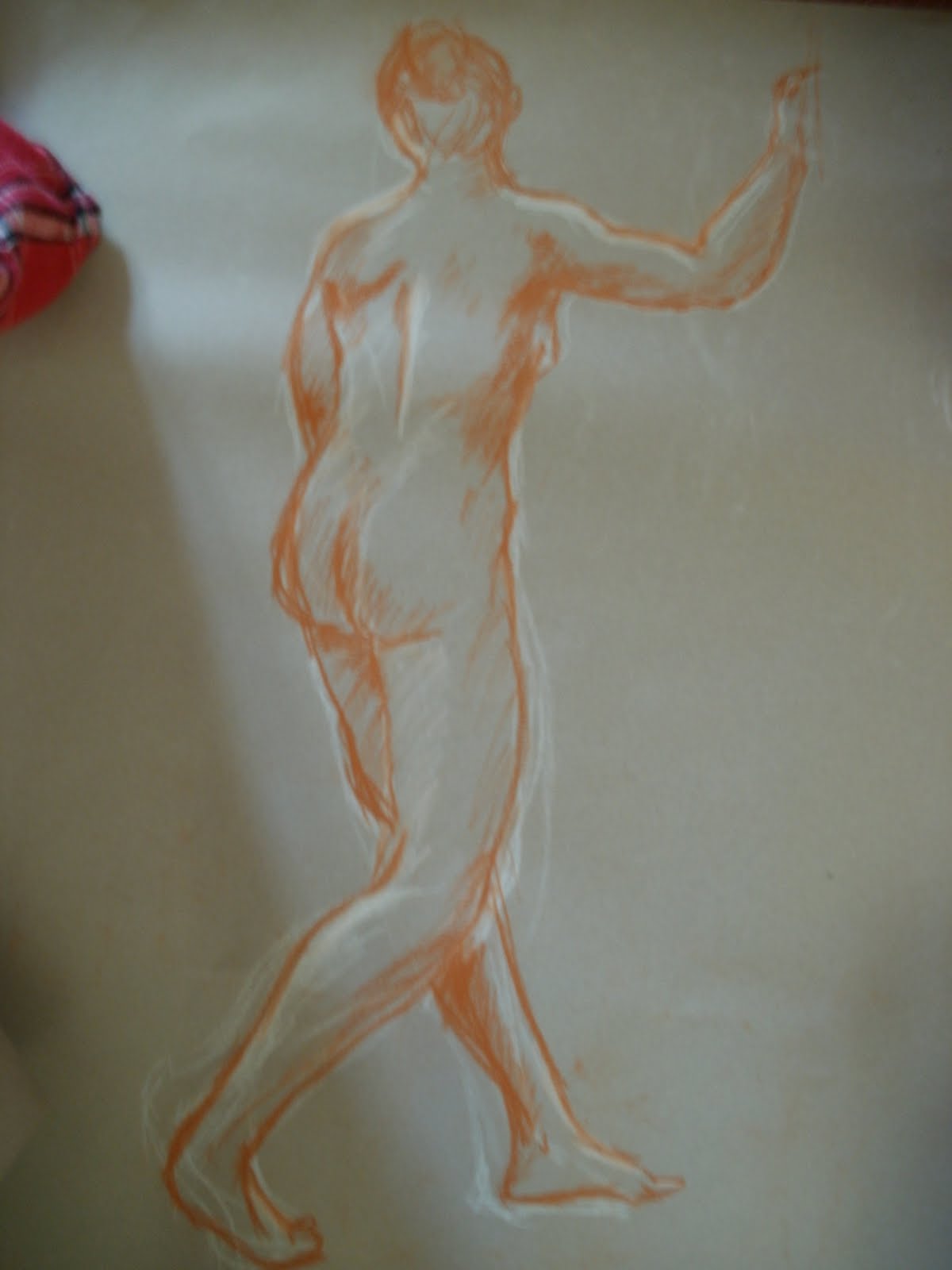
I realised I never scanned a life drawing from last year at any point, so I photographed the pile I'd collected. Expect my foot to make some cameos.


Thursday, 26 May 2011
Crew Productions
Catch up!
I've uploaded the videos of the animation I did of the Inbetween a Fable work.
The crowd of revellers inked, I think mainly based on a photograph. As I gather they're meant to be in the background of the shot although whether its the same one as the musicians I can't say off the top of my head.
The crusader-esque purger of gypsies. I inked and did the secondary animation on her hair strands.
The drummer, the head was a simple translation of the inks to keep it simpler.
The flutist. He was mainly static so this wasn't too bad providing I kept to the right layers.
The dancers inked. I grew to steadly resent those pinstripe trousers, but one thing I liked about this one compared to something like the accordian is that almost all the frames were quite different so it stayed "fresher" feeling and lacked the repetition of one like, say, the accordion (seeing a pattern?).
The final animation I did, the coloured accordion player. She wasn't as red as the other characters when I coloured her so she possibly had some correction done in post.
--------------
Otherwise, I've made a sequence of the TIFFs I drew for Lets Blame Dahmer,which should be my final video upload. The style gets rougher towards the end but fortunately the guy starts to move forwards, so the terrible drum kit gets less attention.
Saturday, 14 May 2011
Negotiated Brief- Fox Fire
I will post my Inbetween a Fable project and my Let's Blame Dahmer work, but until tomorrow I can't use TVP to get the images or videos I need to upload so it has to wait unfortunately.
----------------------------------------------
After getting massively confused with the difference between the pitch and the negotiated project, I eventually settled on creating a pitch bible for one of my comics, Fox Fire. I'll be honest and say that I'm wary of pitching a personal project especialy one I've worked on periodically for so long because it starts to become a little precious to you, but criticism is meant to open your own viewpoints so I could do with some I imagine.
Anyway, making a pitch bible for Fox Fire. While technically I have the designs done, I thought they could do with a fix. I was never completely happy with how the characters looked back when I first started so I took this as an opportunity to give them more finesse then they had.
First up, Shin.
Speaking of feet, these types of legs are a real pain in the arse to get right and it's not often a style that gets used for 2D anthro characters (any examples? I'm stumped). I would swap them for human legs but then it gets into the complicated debate of whether or not you can even refer to it being an animal if it's entire body is obviously human shaped with a human personality, and I quite like the challenge of trying to work out how they'd move. 3D seems to be a better medium for moving these things, I'll try and find some examples for reference.
Otherwise, the legs have been shortened considerably. It's closer to someone standing on tip-toes now which makes working them out for balance a lot easier. Dew claws don't exist. The claws on the feet are based on a ukiyo-e print of an evil kitsune, with the toes and claws very pronounced.
There's a few of the sketches I've been up to, I'll start posting some other character art and some colour stuff.
----------------------------------------------
After getting massively confused with the difference between the pitch and the negotiated project, I eventually settled on creating a pitch bible for one of my comics, Fox Fire. I'll be honest and say that I'm wary of pitching a personal project especialy one I've worked on periodically for so long because it starts to become a little precious to you, but criticism is meant to open your own viewpoints so I could do with some I imagine.
Anyway, making a pitch bible for Fox Fire. While technically I have the designs done, I thought they could do with a fix. I was never completely happy with how the characters looked back when I first started so I took this as an opportunity to give them more finesse then they had.
First up, Shin.
 This is one of the first I ever drew (I think I took it to my interview for this course, so it's at least 3 years by now) and I wasn't exactly confident with drawing digitgrade legs, evidentally.
I had started to adjust his design not long ago, a few of these ones crop up in more detail in my actual work on this project. The main point of Shin's design is that he's meant to look mainly fox-like (in comparison with the foxes in this world) but also slightly off, like he's impersonating a real one. Really he's been put together by people who can't quite remember what one looks like after all this time, so he's had kind of a chinese-whispers effect to his appearance.
I thought his design was too odd clothes-wise and I wanted to make the demon aspect a bit more obvious without making him look really villainous.
Ok, the mask. It was a full mask, then just the face and ears before I just made it a facial one. Shin is meant to be hard to read, but I seriously had nothing with the mask as it was so I decided having real ears meant I could use some canine expressions for things like fear, alertness etc. Something I wanted to change was the gauntlets. Thinking in terms of animation, an 8 segmented gauntlet isn't necessary and is more complicated than it needs to be, so I limited myself to the 4 part one. It's less likely to end up off model too, hopefully.
I tried out different ways of adding claws to the fingers, trying to avoid something like a Disney villain and more like real claws. I settled on drawing them coming out of the place human fingernails grow from. It's a little Pei Mei, but eh. FUN FACT- Shin has 4 fingers and a thumb while everyone else who hasn't had an agricultural accident has 3 and a thumb. He only has 3 toes compared to everyone elses 4. His feet must be lonely :'(
Speaking of feet, these types of legs are a real pain in the arse to get right and it's not often a style that gets used for 2D anthro characters (any examples? I'm stumped). I would swap them for human legs but then it gets into the complicated debate of whether or not you can even refer to it being an animal if it's entire body is obviously human shaped with a human personality, and I quite like the challenge of trying to work out how they'd move. 3D seems to be a better medium for moving these things, I'll try and find some examples for reference.
Otherwise, the legs have been shortened considerably. It's closer to someone standing on tip-toes now which makes working them out for balance a lot easier. Dew claws don't exist. The claws on the feet are based on a ukiyo-e print of an evil kitsune, with the toes and claws very pronounced.
There's a couple of armour sketches to work out how it would attach at the side in a really easy-to-draw way. I ended up going with a basic wrap effect for the sword hilt. The normal kind which criss crosses would get me too wound up so I'm taking the easier route again. How the sword is carried around got a vague scribble down too.
There's a few of the sketches I've been up to, I'll start posting some other character art and some colour stuff.
Saturday, 30 April 2011
Third year project catch up
I was working on a post a few months back but as the work slowly increased it ended up outdated, so I'll try to summarise the work that did get done.
Inbetween a Fable
For the third year project, the rain was successful however the falling rain from a worms-eye perspective looks far too weird to be used, so it's just the diagonal type. I don't know if I'll be asked to more of these as technically I'm not part of the effects work on this project.
So this is out-
-and this one got the ok.
I've moved onto character animation now, although I'm moving at a snail pace with the one piece I've got to animate from scratch. This is the accordian player. animating accordians is actually a lot less interesting than most animations would lead you to beleive, when they're being played they hardly move at all and the weight of them keeps people pretty much pinned. Still, she's a background charcter so they can't all be distracting.
Otherwise I'm lining the rest of the band for the background of the scene. I'm sure there will be more character animation from scratch coming my way soon.
Tuesday, 15 February 2011
Desert designs
Although I haven't yet started work on it, I'm now on animating a character on the third year project. This accordian player is one of the revellers in the celebration scene so I need to make a loop of her playing the instrument.
------------------------------------------------
I will make a pdf of this but here's one of the initial pages of the storyboard for the cinematography project.
 I think despite the fact the characters are drawn as indistinct blob people I was thinking of a storyboard for an animation rather than a film and drew every action of the characters like the actors wouldn't be able to work it out themselves, meaning it's far too long for the amount of action displayed. I gathered from the storyboard we were shown that more detailed images solely for illustrating the type of shot are more appropriate. My current roles for the project are producer and storyboard artist.
--------------------------------------------------------------
When I was researching Apollo, apart from him being a sun god/medicine god/plague god/oracle/general arse as is befitting the greek pantheon, there was a study of two schools of thought in psychology called Apollonian and Dionysian, being sun and earth deities respectively (or cthonic for earth, which sounds so fancy I'm going to try to fit it into my usual vocab). The idea goes that Apollo represents logic and structure while Dionysis represents artistic expression and wildness and with the two together the best tragedies come about- a man tries to create order in a world of a uncontrollable nature and ultimately fails.
The idea I had is the reverse of this- the satyr, as a dionysian creature, is only really concerned with drink, girls and having as much fun as possible but is forced to work by Apollo in a sort of parody of fun, that isn't enjoyable at all. Sort of a reverse of the usual tragedy, in which individualism and freedom of expression is crushed by the pursuit of logic and conformity. Gosh I'm deep.
There will be designs of Apollo posted at some point, he's a pain trying to come up with something.
Here's a few of the backgrounds I've been trying out for the Pre-production, messing around using Corel Painter's artist oils effect. The learning curve for this program seems to be brutal, so I'm not going to attempt drawing characters in it. At all.
 The purple light was meant to look unnatural, but I actually find it quite pretty. One of the ideas I had was that the desert the theatre is set in was actually quite a beautiful place, but it's the presence of the theatre and Apollo that is starting to make it more rigid and structured, losing it's wildness. This is probably a night scene, although with surrealism it's hard to tell.

I'm unsure how to texture in Corel so good, reliable photoshop is there to help out. I wanted to use lots of tectures in this project for the audience and other characters to give them a weirder look, although I need to find out how to use masking properly.

Sort of a WIP as I want to put the Theatre somewhere in the background sucking the colour out of the scene. I was looking at Salt flats for other floor textures and some looked like hexagons, which made me think of a lizard or serpent. This isnt the back of a creature, just a scaly desert.
As tempting as it is to start chucking in some Aztec imagery that's too close to Yume Nikki than I imagine is allowed.
I've done these, but I'm so stuck on this project. Drawing realistically is really, really hard and trying to stop one of the four topics from drifting out of focus from the rest is problematic, particularly the middle ages. All I've got that references it is The Black Death, srsly. I just spent an hour and a bit putting this together rather than attempt anything else. Right now I feel incredibly stressed but there doesn't seem to be a way around it.

------------------------------------------------
I will make a pdf of this but here's one of the initial pages of the storyboard for the cinematography project.
 I think despite the fact the characters are drawn as indistinct blob people I was thinking of a storyboard for an animation rather than a film and drew every action of the characters like the actors wouldn't be able to work it out themselves, meaning it's far too long for the amount of action displayed. I gathered from the storyboard we were shown that more detailed images solely for illustrating the type of shot are more appropriate. My current roles for the project are producer and storyboard artist.
--------------------------------------------------------------
When I was researching Apollo, apart from him being a sun god/medicine god/plague god/oracle/general arse as is befitting the greek pantheon, there was a study of two schools of thought in psychology called Apollonian and Dionysian, being sun and earth deities respectively (or cthonic for earth, which sounds so fancy I'm going to try to fit it into my usual vocab). The idea goes that Apollo represents logic and structure while Dionysis represents artistic expression and wildness and with the two together the best tragedies come about- a man tries to create order in a world of a uncontrollable nature and ultimately fails.
The idea I had is the reverse of this- the satyr, as a dionysian creature, is only really concerned with drink, girls and having as much fun as possible but is forced to work by Apollo in a sort of parody of fun, that isn't enjoyable at all. Sort of a reverse of the usual tragedy, in which individualism and freedom of expression is crushed by the pursuit of logic and conformity. Gosh I'm deep.
There will be designs of Apollo posted at some point, he's a pain trying to come up with something.
Here's a few of the backgrounds I've been trying out for the Pre-production, messing around using Corel Painter's artist oils effect. The learning curve for this program seems to be brutal, so I'm not going to attempt drawing characters in it. At all.
 The purple light was meant to look unnatural, but I actually find it quite pretty. One of the ideas I had was that the desert the theatre is set in was actually quite a beautiful place, but it's the presence of the theatre and Apollo that is starting to make it more rigid and structured, losing it's wildness. This is probably a night scene, although with surrealism it's hard to tell.
I'm unsure how to texture in Corel so good, reliable photoshop is there to help out. I wanted to use lots of tectures in this project for the audience and other characters to give them a weirder look, although I need to find out how to use masking properly.

Sort of a WIP as I want to put the Theatre somewhere in the background sucking the colour out of the scene. I was looking at Salt flats for other floor textures and some looked like hexagons, which made me think of a lizard or serpent. This isnt the back of a creature, just a scaly desert.
As tempting as it is to start chucking in some Aztec imagery that's too close to Yume Nikki than I imagine is allowed.
I've done these, but I'm so stuck on this project. Drawing realistically is really, really hard and trying to stop one of the four topics from drifting out of focus from the rest is problematic, particularly the middle ages. All I've got that references it is The Black Death, srsly. I just spent an hour and a bit putting this together rather than attempt anything else. Right now I feel incredibly stressed but there doesn't seem to be a way around it.
Subscribe to:
Posts (Atom)
