11 Second Club Project Report
At the beginning of the second year, we had two projects set for the group to work on from the start until near the end of term. One of these was projects was to animate characters to a sound clip provided by the 11 second club website, taken from a film or television program. We would then have a month to complete an animation, providing we intended to use the current month’s sound clip.
I chose to animate the sound clip for November, taken from the film “Trains, Planes and Automobiles”. The dialogue in the clip was-
Speaker 1: You stole it!
Speaker2 : I thought (Speaker 1: I-) you put it there!
Speaker 1: ...Why would I put it there?!
Speaker 1: Kindness?
Speaker 2: ...Kindness?! You stole it! He stole it!
The dialogue between the two was a heated argument, with most of the anger directed by speaker 1 to speaker 2. They’re also arguing over something that was apparently taken by speaker 2, so the scenario is a confrontation. For the animation to make sense the stolen object would have to be alluded to visually as the clip is probably referring to something set up previously.
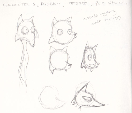
I ran through a few scenarios involving something being stolen, such as two archaeologists arguing over the theft of an artefact or two roosters arguing over an egg. The second scenario made more sense to me as the problem I had with creating scenarios was the line “why would I put it there?” meaning it had to be something that the first character didn’t want to either give away or keep themselves meaning the archaeology didn’t work. I didn’t like the second scenario because i felt using roosters (or lizards and foxes as were the other designs) was sort of bland.
Talking to a friend, he mentioned that part of the background sounds like the crackling of a flame or like a vehicle moving and I thought of the Greek myth where Prometheus took fire from the Gods to give to humanity, and decided that that would be a great scenario to use.
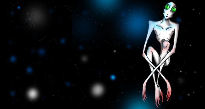
I started looking at old classical statues of Zeus and Prometheus to get a rough idea of how they’d look. My main problem is designing Zeus is I didn’t want to end up with a version like in Disney’s Hercules, but because of the fact that almost all the statues of Zeus share a similar look it was hard to know how to develop that without losing what makes the character recognisable. I ended up varying the guy’s hair and beard but kept the general muscular appearance to suit the angry sound to speaker 1’s voice, making Zeus appear more as a bully (not that he isn’t in myth). Prometheus was easier because he’s less well known, so I went with a skinny, shorter design to Zeus to suit the whinier voice of Speaker 2.
One thing I noticed with the sound clips while creating the dope sheets is that presumably the sound clip is taken from a comedy because of the large pauses for speaker 1’s reactions. I planned for the scene changes to occur during these points, and decided that I’d keep the character animation still at that point to act like a beat panel.
Because of the flame sound in the background I needed to set the scene before the voice clip started up, so I had humans bowing around a large bonfire. Although I’m quite pleased with the finished effect of the flame without having to rotoscope it, making it take up about 2 extra seconds crippled the amount of time I had left to complete the character animation so it feels like unnecessary filler taking up the time I should have spent on the character animation.
With the animation, one of my biggest bug bears was trying to get things to move in arcs to look more natural. Zeus raising his arm to put his hand over his face originally had a much more exaggerated movement that went completely out of frame for a bit but because of the amount of frames allowed for that movement I had to scale it back to keep it to the right timing.
One of the things I’ve been criticised of before is animating too much at the same time, so I made a point of keeping both characters moving only when they’re speaking, so the focus is on them. I did have P moving in the last shot trying to get up from the floor, but I realised that if Z was moving in the centre of the shot and the eagle was moving off to the side, having movement in the opposite corner would make it too busy.
I think the most obvious and damning thing about the final animation is that it simply isn’t finished. I would put illness down to this in part but more likely it is terrible, terrible time management on my part. I started this project far too late in to the term with characters that were more complicated to animate than something simpler.
The flame animation took far too much time and should have really been completed more towards the end of the project. Focussing on secondary animation with the characters before all of the rough movements were mapped out means that only parts of it ended up being inked as I didn’t have the time to plan and test the movements beforehand. I would try to complete the secondary animation on some of the shots before the primary animation of others had been done.
For me, the movement of the characters seems very rapid and like there should be more holds but as I can’t change the length of the sound file I think the transition between shots meant that the movements looked rapid. Keeping the characters to the correct proportions and trying to indicate weight without a full body was very difficult for me.
--------------------------------------------------------------------------------
So that's the projects done. I'm certainly not happy about my 11 second but the experimental made those two weeks of dope sheeting all worth it.
Wednesday 1 December 2010
Tuesday 30 November 2010
Experimental Animation
Because Moodle is being (in the politest terms possible) massively crap this is the only version of the finished experimental project that I can upload.
Saturday 27 November 2010
Video tests
Trying desperately to get the animations to show up, I've made 4 WIP's of the current progress of the 11 second club project.
The animatic, with the most basic movments planned. The final shot of the storyboard that I hadn't decided on ended up being used as I liked the idea of the third party being next to the confrontation rather than in the distance as I'd previously planned.
The first attempt, I was originally going to rotoscope the flames which would have probably been ten times easier, but instead I drew them out using a few beginning frames as reference. Turns out flames are very hard to do.
The second vid. Slightly more detailed in the actions.
The third WIP has more detail in the movement of the characters. I removed the red lines for this version so the blue lines would be more obvious and changed the gesture of P's from both hands to only the one because I thought it looked more natural.
Fourth Wip and not far from when I start inking. The lip sync was added before the eye movements as I wanted the mouthes to be as exaggerated as possible without relying on the eyebrows for the expression too much. It's hard to lip sync mouth movements like "ay" when that expression normally appears as a happy mouth shape, so I had to twist some of them to look angrier.
Saturday 20 November 2010
The Rough Work


Designs for the Eagle have been done. It isn't meant to do much body wise apart from react to Z's rant at the end, so all the movement is in the face and head.
The Warhol-print was just for some colourful fun.
Most of the Eagle's reactions are drawn here for reference in the animation. I will probably have to do one for Z and P rather than trying to guess what the face will look like.
Design wise, it's just a big eagle. Not much more to it than that.
--------------------------------------------
Okay, I have tried repeatedly (last time was about the eighth) but I cannot get videos to upload on to my profile with the current internet, either with blogger or youtube. If I can find a connection good enough to get some up I have some WIP's to upload, but until then it's a no go.
Friday 12 November 2010
Who stole it?
After trying to finish the arduosly boring task of filling in the dope sheets for the experimental animation, I've started to jot down some rough character sketches ready for the 11 second club project.
I had a few ideas for the project. One involved two archeologists arguing over the removal of an artifact after the former had put it back in it's rightful place, except that didn't make any sense with the "Why would I put it there " part. Another was either two foxes/lizards or two roosters with a stolen egg, which made slightly more sense as they wouldn't have a reason to leave an egg there. They all ended with the offending eggs parent (being a lot larger than the main characters) showing up at the "He stole it!" part.


I didn't really feel the ideas were that good, feeling more average than anything and as three of them were the same scenario with different characters I wanted something different.
Thinking of an example where someone would be angry at somebody else for stealing, and also why there would be a crackling sound in the background, I remembered the old legend of Prometheus stealing fire from the gods and thought it would be a good scenario if he was completely unaware of how bad an idea that was.


(No designs for P as of yet as they aren't scanned.)
Here are the storyboards. The idea is that in the establishing shot, the humans are worshipping the great big fire, which is meant to be the crackling sound in the background of the sound file.

Most of the shots are static to make it easier on myself animation wise, but this means that the facial expressions need to be suitably deformed.

The backgrounds are noticably sparse. I'm slightly confused by the amount of detail we're meant to put into the animation, so the layout design is something I'll need to look out later. As the characters are so static they aren't moving around the area that much, so its more for setting the scene than anything.

I had a few ideas for the project. One involved two archeologists arguing over the removal of an artifact after the former had put it back in it's rightful place, except that didn't make any sense with the "Why would I put it there " part. Another was either two foxes/lizards or two roosters with a stolen egg, which made slightly more sense as they wouldn't have a reason to leave an egg there. They all ended with the offending eggs parent (being a lot larger than the main characters) showing up at the "He stole it!" part.

I didn't really feel the ideas were that good, feeling more average than anything and as three of them were the same scenario with different characters I wanted something different.
Thinking of an example where someone would be angry at somebody else for stealing, and also why there would be a crackling sound in the background, I remembered the old legend of Prometheus stealing fire from the gods and thought it would be a good scenario if he was completely unaware of how bad an idea that was.
So I've stuck with that idea! Here are some of the designs for Zeus, although I've put it as Z in my storyboards to save typing his and Prometheus' names out over and over.


Also, yes, there is a vampire Zeus and Left4Dead Bill Zeus. Don't ask.
(No designs for P as of yet as they aren't scanned.)
Here are the storyboards. The idea is that in the establishing shot, the humans are worshipping the great big fire, which is meant to be the crackling sound in the background of the sound file.

Most of the shots are static to make it easier on myself animation wise, but this means that the facial expressions need to be suitably deformed.

The backgrounds are noticably sparse. I'm slightly confused by the amount of detail we're meant to put into the animation, so the layout design is something I'll need to look out later. As the characters are so static they aren't moving around the area that much, so its more for setting the scene than anything.

Here the final shot is not inked as I'm sort of stuck with it. Either Z is shaking his fists in the distance at the "He stole it!" line, with confused people in the foreground, or he is addressing a large eagle relating to the legend. I've got two issues with these- if its the former, then Z is no longer the focus and the scale of whatever structure the two are observing from has to be large enough to be impressive but enough so that Z is still visible. If the latter, although the two characters are the focus I'm worried the appearance of the Eagle would come out of left-field for some people.
Until I can test the scenes with an animatic I can't decide between the two currently. The storyboard will be revised gradually in case I need to modify the movements to be more exaggerated.
While I do have an animatic it is extreeeeeeemely rough, barely even stick figures. Uploading it with my current internet is proving almost impossible, so when it's improved I'll load a copy on to youtube and post here.
Wednesday 3 November 2010
Quick Test
Here's a tester lip sync of the sound file for the 11 second club. Just going on what I'd written down on the dope sheet in terms of the sound meant that the lip sync seems very flat and emotionless, so I need to add more notes to the sheet.
Tuesday 26 October 2010
Change of Emotion
Here's the final version of the change in emotion. I can't remember how I came to this mildly immature idea, but I stuck with it ayway. Should probably do something easier next time (I feel I've said that a lot).
Wednesday 20 October 2010
Emotions in animation
This weeks subject is about changing emotion in animation, so I thought it's about time I posted more examples of such a thing on my blog before I get started. I tend to work without any reference, so this time I'll try to find a mixture of stills and footage to use. (all of which belong to the original owners).
Here's some examples of the ways different animations can express the same emotion.

In calmer poses the body is more like the characters natural shape to show that they're relaxed- there's no need to exaggerate anything on them.

This pose doesn't use much body language but the exaggerated facial expression shows that Gir does indeed love the moose.
 Here the animaniacs are slightly stretched upwards, like the emotion is so strong they're being literally pulled off the ground.
 This one is more maniacally happy than the others, but can show how easily happy to anger to sadness can happen just by changing the eyebrows.

Another borderline manic/happy pose, more exaggerated than the animaniacs. Everything seems to generate outwards from the character to show the energy.
More negative emotions-
 The posture is rigid, but not explosive like Zim. This character is angry but shows it in a more reserved way in the way he clenches his fists close to his body.

This is the complete opposite of the above in terms of action. He's still rigid, but the facial expression and threatening gesture make his anger much more explicit, especially coupled with Stimpy's own frightened expression.

This look of fear is just that- a look, but the position of the ears on the characters head reflects animal expressions.

This ones all out. The character is so frightened they've turned into a ball, fur stood on end in all directions.
This is really more of a recap for myself so I know what sort of things to look for in a performance, depending on the type of character involved. It seems like more realistic characters rely on more subtle facial expressions than the deformity that more cartoony characters can get away with.
(Heres how I looked after finding all the images------¬

----------------------
For the experimental animation, I'm trying to think of some examples using the methods described but I tend to confuse "abstract" with "experimental", which makes looking for footage confusing for me. One example I could think of that although I think it's made with compositing different film footage rather than an animation technique it is timed with different pieces of footage depending on the sound- Star Guitar, by the Chemical Brothers.
(Have I posted about that already? I can't remember). I had some problems trying to find a video that wasn't disabled, so here's a link in case this one is too- http://www.youtube.com/watch?v=0S43IwBF0uM&ob=av3
Here's a little something too, for some really, REALLY exaggerated facial expressions. May involve Halo.
-----------------------------
Here is a version of my emotion changing animation, hopefully expressing surprise and disgust. You can see its a work in progress, but as the roughs are done I thought I'd upload the video earlier.
Here's some examples of the ways different animations can express the same emotion.

In calmer poses the body is more like the characters natural shape to show that they're relaxed- there's no need to exaggerate anything on them.

This pose doesn't use much body language but the exaggerated facial expression shows that Gir does indeed love the moose.
 Here the animaniacs are slightly stretched upwards, like the emotion is so strong they're being literally pulled off the ground.
 This one is more maniacally happy than the others, but can show how easily happy to anger to sadness can happen just by changing the eyebrows.
Another borderline manic/happy pose, more exaggerated than the animaniacs. Everything seems to generate outwards from the character to show the energy.
More negative emotions-
 The posture is rigid, but not explosive like Zim. This character is angry but shows it in a more reserved way in the way he clenches his fists close to his body.
This is the complete opposite of the above in terms of action. He's still rigid, but the facial expression and threatening gesture make his anger much more explicit, especially coupled with Stimpy's own frightened expression.

This look of fear is just that- a look, but the position of the ears on the characters head reflects animal expressions.

This ones all out. The character is so frightened they've turned into a ball, fur stood on end in all directions.
This is really more of a recap for myself so I know what sort of things to look for in a performance, depending on the type of character involved. It seems like more realistic characters rely on more subtle facial expressions than the deformity that more cartoony characters can get away with.
(Heres how I looked after finding all the images------¬

----------------------
For the experimental animation, I'm trying to think of some examples using the methods described but I tend to confuse "abstract" with "experimental", which makes looking for footage confusing for me. One example I could think of that although I think it's made with compositing different film footage rather than an animation technique it is timed with different pieces of footage depending on the sound- Star Guitar, by the Chemical Brothers.
(Have I posted about that already? I can't remember). I had some problems trying to find a video that wasn't disabled, so here's a link in case this one is too- http://www.youtube.com/watch?v=0S43IwBF0uM&ob=av3
Here's a little something too, for some really, REALLY exaggerated facial expressions. May involve Halo.
-----------------------------
Here is a version of my emotion changing animation, hopefully expressing surprise and disgust. You can see its a work in progress, but as the roughs are done I thought I'd upload the video earlier.
Saturday 16 October 2010
Flash pains
Oi....
Seeing as I can't use CS5 files on CS4, I planned to start my flash outside of the studio and import it in to work up at the uni, giving me the whole weekend to work on the walk.
Which would be a fine, if flash didn't load everything I do at a frame per minute. Kind of puts a spanner in my work plans.
Otherwise, I drew another image for watercolour practice.
 I seem to end up doing quite baggy clothing on any designs, I just like the way that fabric falls around the folds.
----------------------------------------
Alternatively I have now finished my walk cycle and I hate it.
I'll make it easier by listing-
1. No secondary animation on the arms or head when they stomp.
2. The foot for some reason goes into a tip toe shape rather than the heel hitting the ground first.
3. All of the proportions change like crazy frame to frame.
I will fix this thing eventually, it certainly has enough things wrong with it to warrant a remake. I'd say the walking speed is more of a slow stomp though, so I may have inadvertantly made a good reference for a zombie shuffle.
Wednesday 6 October 2010
New term
S'up.
Starting with the animation weight exercise, it's a great way to get me back into the habit of actually a)working and b) practicing after classes. I'm quite rusty after the holiday, so I'm going to try to get the best possible movement on this thing so I can see where I seriously need to brush up.
Never being one to try something simple, I decided to animate one of my characters, Max the Vampire Kleptomaniac, lifting. He's fairly simple as a character although theres a lot of secondary animation with the hair and clothes to think about with the movement.
This started out fairly well for me, and I'm pleased with the movement of the hair and the squash and stretch when he's trying to shift the box but as with all of my projects I ran out of time at the end and it got quite rushed. Add to that the exported file seems to run at a lower frame rate and the action comes off as more jerky.
Saturday 4 September 2010
Gosh how busy I've been
...doing absolutely nothing.
No, this blog hasn't had much added to it over the summer. I had a horrendously bad art block at the beginning of July and it's been an age since I've been able to even think of anything worth painting or drawing. Not even any ideas for animating. I;m hoping I can change that this last month.


The reason for my art block is these two (insert whatever expletive works best here). These would both be page 7 in the first chapter, but as you can see I changed my mind how it ought to be laid out halfway through working on the first. Towards the end fo the second (while running out of copic markers as well) I decided I couldn't think of a way to write the first chapter that wouldn't be horrendously dull and done to death. Coupled with some on the spot designs I'm going to write to at least the fifth chapter before I even start doing pages again. It just goes to show how important planning is. Tip of the day, kiddies.
Towarsd the end of this month,I did start trying to fill out a sketch book with doodles-

Trying some head designs. I like the top left one and the child holding the frog best. I decided I'd try and do something sort of care free using the bottom left style, something having to bother with proportions too much-

...and then I went OCD with the proportions and dropped doing a stylised version completely. The left arm came out pinker than intended because of a lack of flesh tones in my pencil set, leading to orangey-pinky-browny guess work.
Then I got it into my head to do a water colour piece.

Thanks to watching Neo Tokyo Labyrinth I can't get Gymnopedies out of my head. I love this piece of animation, it's so strange. It always reminds me of the sort of nightmare you'd have as a child, where everything is sinister.
Wednesday 9 June 2010
Animal Firm finale
Well, it's all done now. As most of the images were completely coloured in the last week, I can post them up now.

The Chameleons are a corporate business that specialise in information trafficking, and help crime syndicates cover up more noticable crimes- for a price. Having such a large amount of information about the syndicates at their disposal, they have the capability of exploiting the gangs for their own personal gain whenever, where ever. They also act as a loan company with a price higher than the money borrowed.
They work in with the Loan Sharks, who are the debt collectors for them.

Benny's night club Lapdogs which is the main scene, really, as this is where the whole Poker game goes very wrong.

The Chameleons at a board meeting, the higher up chameleons have larger horns and a more dominant attitude, like the chameleons in real life.

The line up of the characters, from left to right- Ethan, Benita/Benny, Pasha (the bear), Aleister (the snake), Salma, Hiroshi, Cecilia, Hampton and a Chameleon agent.
I'll only up load these images as I think the three largest ones are probably the best work me and Al did, and the chameleon with a gun is just a favourite of mine. That's not saying that the rest of the work is of a lower standard, just that these are the ones I think we put the most time in to.
Personally I'm very happy with this project. Alberto and I had the main plot and characters decided on in writing a few weeks before the What project, so when we had to animate for the two weeks we seem to end up in the same time frame as other people. The colouring and a few designs were done in the last week, and Alberto finished the whole project in InDesign to make it look pretty professional. I really think we did well with this one.
That's it for the year, isn't it? Only waiting for the grades to come back now, so nail biting time for the next week. I may try doing a summer project over the Holiday just because I can see me becoming endlessly bored otherwise. I have a few ideas, although most are comics, but I suppose I can still post them. It's character design after all.
Saturday 5 June 2010
Reference for Animal Firm


To save me getting reference later, and also to catelogue the images I'm likely to print of for use in my reference book I'm going to post some images up here that I need to use for designing the Koi carp and the High ups in the Chameleons group.
Thursday 3 June 2010
The aftermath and animal firm
I went to the screening yesterday, and really enjoyed the other projects shown. I don't think anybody had an idea that was similar to another groups, so its amazing how differently people can interpret a brief.
The feed back on ours was sort of what I was expecting. When I did the track laying I had a suspicion it was going to come off as being very quiet, and the sounds I had were a variety of mono and stereo so I thought that might affect the audio quality. To be fair though, I did have an hours sleep was working at about 5 in the morning on it, so I probably couldn't hear things normally anyway.
Kathys project is done and dusted, and I managed to not post any images of it up at all. Sorry Kath.
I did photograph a few of them before I handed the book in though.

I do have the original sketches somewhere, but wuth these two images I wanted to work into them more, so here is Alberto in the style of a hieroglyph and Alan in the style of a picasso image.
 I'm pretty fond of the Alan one actually. And no, it's not a basket ball.
Alberto and I were pretty far ahead with Animal Firm a few weeks ago so we could devote our time to the group project without suffering too many set backs, but we've now started colouring the characters ready for doing backgrounds and action shots. Here's a coloured Benny for his profile image. We're also hoping to do a character sheet in the style of a police height chart!
Sunday 23 May 2010
Episode Four- Final Week
Wow, this has been a very tiring project. I don't think I've worked this hard on an animation at all this year, and I know everyone else has been working their hardest as well to get everything done for the deadline (I hate deadlines...)
This week I've been continuing to get the animation drawn, which backfired on me this week because I spent last week drawing the easiest ones. I spent most of my time drawing the ending scene, which I then coloured and hated every minute of it for doing it frame by frame.
The animation wasn't finished when I'd hoped it would be. I'm a terrible producer.
But enough provaricating, here is the final thing-
Sunday 16 May 2010
Episode Three- Hardest week
This marks the week that the group have to begin animating the project, ideally completing the animation process before the start of next week (which will be used for post production). I'd much prefer not to be doing these projects on the day of the deadline, so really tonight is the last night I can feel relatively at ease considering the amount of work that needs doing.
The animation is being completed on Flash for the sake of speed and time, as we can correct the timing issues by reordering the key frames around whenever and can exchange the files between one another depending on the roles we have in the process. Everyone is on animating duty, along with colouring, but Alberto and I are working on key frames. With some pieces though, we'll line and do the inbetweens for ourselves.
The style of animation is meant to be very wobbly lines around the characters, rather like Rhubarb and Custard in that the characters never seem to be still. Although the wobbly lines mean that tracing it frame-by-frame will be slightly easier as we wont have to keep rigidly to the guidelines, we'll have to keep an eye on changes to the characters mass.
While we have at least two scenes done, I can only post this one as my laptop doesn't have quicktime, so I can't make another file type that blogger supports (and youtube really dislikes me uploading for some reason) but here's one completed sequence minus the 3d background and colour.
Saturday 8 May 2010
Episode Two- Start the ball rolling
This week was to make up for the previous week, when most of the other groups had begun their pre production work so the group put a lot of effort in to getting the work done in a shorter time frame.
It took a while, and it turned out to have more pages than the Knightrider script, but the storyboard is now completed.


 As the other work isn't mine, I'll leave it to the others to post up their work, but this is the WIP Animatic (minus sound) that Nigel made.
It took a while, and it turned out to have more pages than the Knightrider script, but the storyboard is now completed.


 As the other work isn't mine, I'll leave it to the others to post up their work, but this is the WIP Animatic (minus sound) that Nigel made.
Subscribe to:
Posts (Atom)
